bluegogo
From Isolated Failures to Systemic Recovery,
A Service Experience Redesign Guided by User Emotion Signals
When Growth Turned Into Loss of Control
2023, I worked with Bluegogo to launch a bike-sharing service in Zengcheng. I led the product from 0 to 1, combining user research with end-to-end visual and interaction design.
4 months after the project launch, the bikes began to get damaged. As a result, users frequently encountered broken bikes when trying to unlock them, which led to a massive influx of complaints and negative reviews for the brand.

Silent Users: The Dual Crisis of Broken Feedback and User Churn
In contrast to these external signals, in-app data showed a consistently low rate of reported damages. This suggests that after negative experiences, users had simply given up on our service.
While this feature was originally designed to collect maintenance data, the lack of user engagement meant we were not only losing our customers but also losing critical visibility into our fleet's actual condition.

The Challenge: A System Under Strain
As the issues surfaced, we were not facing a single, well-defined design task, but a rapidly escalating systemic crisis. These problems spanned multiple functions and amplified one another across the system:
Maintenance could not keep up with the concentration of damaged bikes, turning repair capacity into a growing bottleneck
Design lacked sufficient and reliable reporting data, leaving the true health of the fleet largely invisible
Operations faced a continuous decline in brand perception, with user churn and negative feedback reinforcing each other
At this stage, we were not yet in a position to “fix” the problem, because we had not fully understood it.
My role
Led end-to-end experience redesign addressing systemic issues.
Collaborated with 2 designers , 1 researcher + 2 product managers to align design with user insights and product strategy.
Kick off
Approach: Grounding the Design in Real-World Usage
Before jumping into solutions, I focused on understanding the problem with 2 other researchers.
Our research deliberately focused on moments of system failure rather than smooth usage, capturing how users behave when things go wrong.

Early observations
We conducted field research and interviews in the city’s busiest bike-use areas, locations where failure would have the highest impact. We recruited 8 participants to test the full app experience.
Users Frequently encounter with damaged bikes
Users typically need 2–3 attempts to successfully unlock a functional bike. (Some bikes are damaged, and users can only find out when they see them.)
Recommended bikes don’t match actual accessibility
The app often suggests the nearest bike, but when that bike is unavailable, users can‘t easily find alternatives nearby.
Multi-step, non-intuitive interfaces discourage users from report damages (core finding)
The current repair reporting flow requires four steps, including photo uploads and written descriptions, creating a high-effort interaction.
Users believe reporting issues rarely leads to real maintenance
Users lack trust in the repair system, perceiving issue reporting as a formality rather than an effective solution.
Discovery
Changes in User Emotion: Small Triggers, Big Reactions
While observing these behaviors, we noticed an important pattern: user emotions fluctuated significantly during their interactions.
These changes were visibly expressed on their faces, especially when encountering failures, users’ frustration, anxiety, and even anger became apparent. This caught our attention, as it may partially explain the negative reviews and complaints we had previously received.
From Emotional Signals to Data
Further analysis revealed a key aspect missing from our previous user personas: most bike usage occurs during high-pressure peak hours, commuting to work, school, or other nearby destinations. Users are often pressed for time, and losing several minutes repeatedly due to unlocking damaged bikes created stressful, time-sensitive situations. Each failure experience was a direct trigger, straining their patience and heightening frustration.
“ need a quote here"
Sentiment Model: Working Backward from Perfect
Focusing on this key metric, we built a sentiment model by working backward from the "perfect state." We identified signals from every user touchpoint and translated them into measurable metrics.

Deeper Insights on user's emotion changing
Synthesizing observational data and sentiment metrics, we identified four deep insights:

Trust declines under pre-unlock uncertainty
Users face pre-unlock anxiety without bike condition visibility; repeated faulty bike unlocks amplify this concern, and this concern becomes the emotional starting point of the entire riding experience.
Time-pressure anxiety breaks the malfunction reporting flow
The reporting flow requires both photo capture and manual text input, creating a high-effort interaction.
Under time pressure, users are reluctant to engage with reporting, so skipping reporting becomes a rational choice for users.
Users don’t believe malfunction reporting leads to real improvement
Users generally do not believe reporting will lead to meaningful improvements, this lack of trust not only reduces reporting, but also distorts system data and delays real improvements.
Unreliable recommendations make users feel misled
When users follow a recommended route to a bike that is unusable, and find no nearby alternatives, they experience frustration and feel misled.
Discovery
The Core of the Problem
We have identified that the collapse of user experience stems from a systemic chain of defects within the bike-usage process:
Accessibility Gap: Users cannot locate available bikes quickly, as the positioning logic fails to account for actual physical accessibility.
Process Friction: The repair reporting process is cumbersome and inefficient, creating a direct conflict with the users' urgent commuting needs.
Compounding Frustration: Defects at each stage stack up, leading to repeated failed attempts and escalating frustration, which ultimately crystallizes into a negative brand perception.
“ In short, we delivered a high-risk experience that forces users to
pay the price for our system’s inefficiencies. ”
Introducing the "Bike Health System"
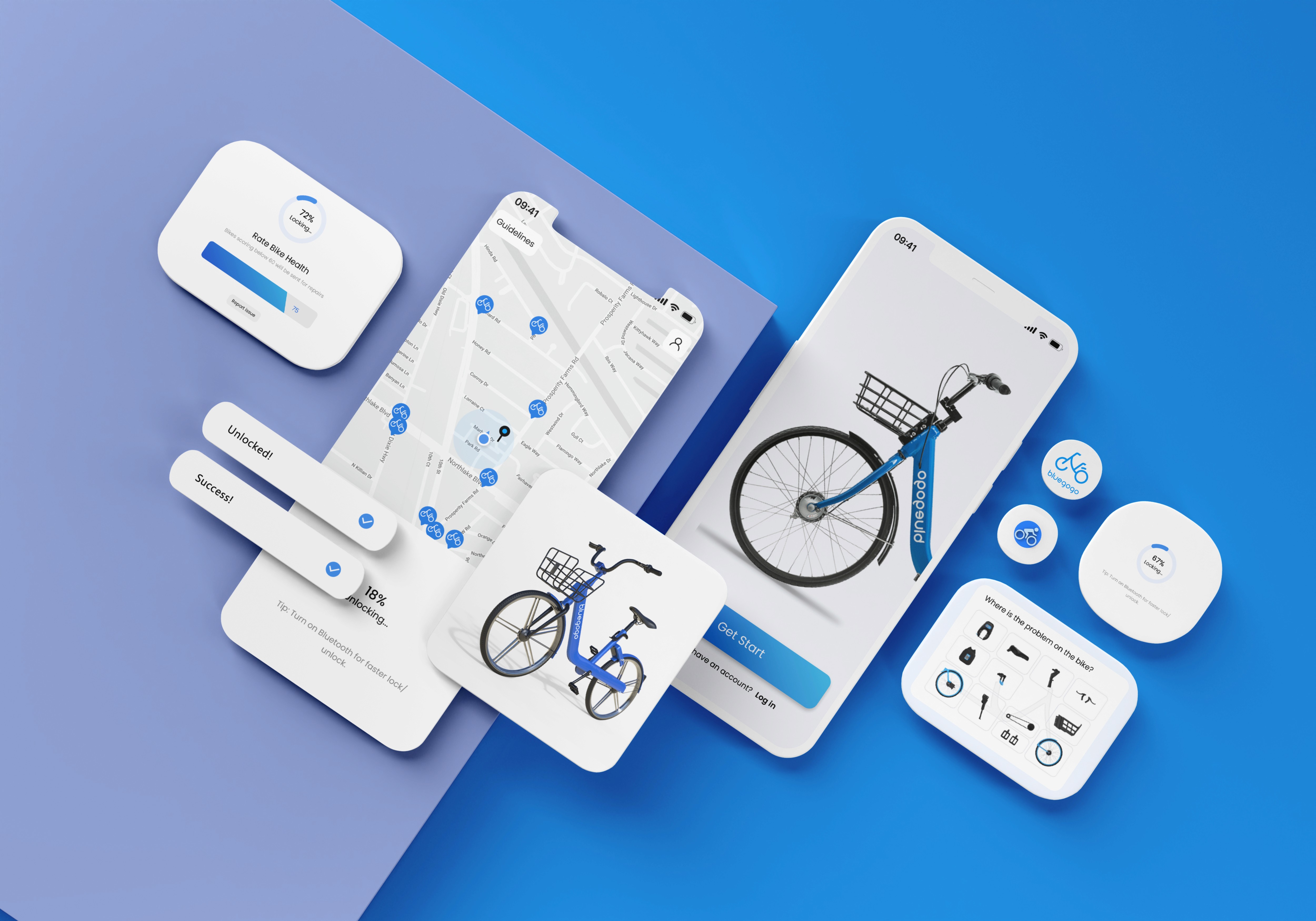
Instead of treating features in isolation, this redesign focuses on the holistic user journey. By integrating an optimized reporting flow, intelligent vehicle recommendations, and a closed-loop "Health Scoring" system, we created a synergistic ecosystem.
This approach ensures that users can seamlessly locate available bikes, report issues with minimal friction, and receive real-time transparency regarding vehicle condition.

Streamlined Reporting (1 min → 10s)
Optimized the flow by removing mandatory photos and adding one-tap voice reporting. This reduced task time by 80%, creating a truly low-friction experience.
Smart "Cluster" Recommendations
Upgraded logic from "nearest bike" to "accessible clusters." By presenting multiple reachable options, we empower user choice and minimize unlock failures.


Vehicle Health Scoring (1–5)
Introduced a visual health bar (1–5 scale). Initialized by maintenance and updated by users via a simple swipe at trip-end, ensuring real-time data accuracy.
Closed-Loop Feedback
Users receive proactive push updates on repair progress. Closing the loop from "reported" to "fixed" builds long-term system trust and user engagement.
How We Got Here
The first core update focused on streamlining the reporting process.
This issue was not only a source of user friction, but also prevented the system from obtaining reliable bike damage data. As a result, the system lacked visibility into real-world conditions.
Therefore, this update was essentially about “rebuilding the system’s eyes” to capture accurate, real-world signals.

Time efficiency is the key
Reducing Friction by Returning Time to the User
In our audit of the existing flow, we found that while each step seemed logical in theory, the cumulative completion time was nearly one minute. In urgent commuting scenarios, this was unacceptable.
Our goal was singular: to aggressively streamline the process for the user without compromising the data depth required by the backend.

1. Vehicle ID: Manual to Automated

Before: Manual ID entry was required. While designed for "locked bike" reporting, this scenario was statistically rare.

After: Auto-detection. The system automatically syncs current bike info, eliminating manual input entirely.
2. Component Lists to Visual Mapping

Before: Users had to select specific parts from a distorted bike graphic to make a specific report.
After: Visual Interaction. Users simply tap the bike image to mark an issue.
3.Mandatory Photos/Typing to Voice-First

Before: Required mandatory photo uploads and manual text descriptions.

After: One-Tap Voice (ASR). Removed mandatory photos in favor of voice-to-text.
During testing, the workflow optimization showed significant improvements:
1, Substantially reduced completion time: Most users were able to complete the entire repair request flow in approximately 10 seconds.
2, Improved information accuracy: Voice messages enabled more detailed and specific problem descriptions. Test participants were typically able to provide sufficient detail within about 5 seconds, whereas typing the same amount of information took 5–10× longer.
3, Enhanced backend data observability: The number of data categories required for monitoring was reduced.
However, Risks Remain.
Although optimizing the reporting feature helped alleviate some local pain points, it did not fundamentally eliminate user uncertainty during the riding experience.
The problem was not incidental, but rooted in systemic structural risks:
The bike damage rate continued to rise
The probability of unlock failures increased
A long-term imbalance persisted between bike availability and maintenance capacity
Even as the reporting flow became faster and smoother, users still could not assess a bike’s health status before unlocking it. As a result, every ride still carried the risk of immediately triggering a failure experience.

How to prevent failures before users encounter them?
Firstly, we redefined our design goals:
To create a sustainable positive loop between product interactions and functional modules, where user behavior, data collection, and system decisions mutually support and continuously reinforce each other.
Around this goal, we focused on three core design actions:
Prevent Ineffective Unlocks
Identify and intercept damaged bikes before users attempt to unlock them, avoiding immediate failure experiences.Encourage User Data Feedback
Guide users to report bike damage information through low-friction interactions, gathering high-quality data.Guide Users to Make Reliable Choices
Recommend bikes with better condition and viable alternatives based on retrived data, helping users make more dependable decisions.

When users consistently provide reliable data, the system can more accurately assess a bike’s availability and condition.
in turn, it enables the product to inform users with real-time condition of the bikes to help users locate a better bike, and also guide them toward better alternatives, preventing failure experiences.
Ultimately, this creates a closed loop:
User Feedback → Improved Data Quality → More Accurate Assessment & Recommendations → More Successful User Decisions → More Effective Feedback
Once this positive cycle is established, both the product experience and system efficiency improve simultaneously.

A Voice for Bike Health
This is why we introduced the concept of a Bike Health Score. Each bike has a health bar that is updated in real time based on user feedback and ratings.
This concept is like giving the system, after acquiring a pair of eyes to see real data, a mouth that can speak, it not only informs users, but also tells us how to take the right actions and strategies.

Lightweight User Interaction
On the bike lock interface, the Bluetooth lock takes about seconds when parking. During this waiting period, users can rate the bike via one swipe.

Real-Time Feedback for Users
Bike health scores are updated in real time, and bikes with low scores are highlighted with distinct colors to help users make better riding choices.

Efficient Support for Backend Operations
Maintenance teams can also view the distribution of bike health scores. Which allows they to plan and prioritize the maintenance of problematic bikes.

Intelligent Recommendations of Available Bikes
Using the health score data, the system can intelligently recommend nearby bikes. .
Be smart on Recommendation
After optimizing the reporting process and establishing bike health scores, we designed a flexible smart recommendation system. Its core principle is to provide users with the healthiest and most accessible bike options, minimizing the risk of unlock failures when the data is reliable.
Health-Score Driven Recommendations: Recommendations are triggered only when the system has high confidence in bike health scores, which are dynamically updated to avoid suggesting unknown or incomplete data bikes.
Multiple Candidate Options: The system recommends clusters of nearby healthy bikes, allowing users to choose freely and reducing repeated searches caused by single-point failures.
Path Feasibility Consideration: Recommendations account not only for straight-line distance but also for actual path accessibility, ensuring safety and efficiency.
Dynamic Adjustment: Bike selection or unlock triggers real-time updates to health scores and status, optimizing subsequent recommendations and forming a self-reinforcing positive loop.
Through this interaction update, we no longer “mislead” users:
Reduce Unlock Failures: Users are not directed to unknown or damaged bikes.
Minimize Trial-and-Error: Multiple options allow users to select the most suitable bike.
Enhance Predictability: Users can see bike status at first glance.
Closed-Loop Experience: Integrated with the reporting process and health score system to provide a complete, reliable riding experience.

After three months of intensive design updates, the team continuously refined the app during development, improving both core interactions and visual design. The main core features of the new app were launched online. Two months after the update, we began to observe positive impacts.
Impact of the Design Update
Data Trends Reversed
Changes were not immediate, but within 1–2 months post-launch, key metrics began to show clear positive signals, reversing the previous downward trend.User Experience Improved
User satisfaction (UP score) increased by 0.4 percentage points within two months.
The prior sharp decline was halted, and the curve shifted to a slow but steady upward trend.
This sustained improvement indicates lasting UX gains rather than short-term spikes.
Maintenance Efficiency Boosted
Lower reporting barriers, higher accuracy, and reduced data noise enabled clearer insight into bike issues.
Maintenance efficiency increased by ~30%, with resources allocated more strategically.
Overall bike health and stability improved, laying the foundation for recommendation and health score systems.
User Retention and Growth
Reduced failure rates stopped the previous user churn.
Over six months, the project gained ~18% new users organically, driven by improved system reliability and positive word-of-mouth.
Reflections & Limits
System Complexity and Continuous Change: Design in Motion
Although the recent design update has shown positive trends, the project still faces long-term, real-world challenges. This is a highly complex system where the app experience depends not only on interface and interactions, but also on multiple factors:
Bike hardware condition
Maintenance resource allocation
Urban environment and road conditions
User scenarios and time pressure
Even if a single component is optimized, overall experience can still fluctuate due to other nodes in the system.
Design Must Stay Sensitive to a Changing System
The product itself is not static. Market conditions, user composition, usage frequency, scenarios, and expectation thresholds all evolve over time. This means there is no “final solution.”
Designers cannot provide a one-time fix; instead, they must continuously observe user behavior, detect emerging risk signals, and intervene when the system deviates from expectations.
From this project, I realized:
Some user frustrations can be alleviated through design.
Some issues can only be anticipated and managed proactively.
Others require cross-team collaboration and long-term strategy.
Here, design functions more as a continuous calibration system than a tool for one-off problem fixing.